
 Marcio Vasconcelos
As we move further into 2024, the world of interior design continues to evolve, bringing new life and color into our living spaces. Paint colors, in particular, play a pivotal role in setting the mood, tone, and overall ambiance of a room.
Whether you're a seasoned interior designer, a home renovation enthusiast, or someone looking to refresh your space, staying updated on the latest paint color trends is essential.
Here, we'll explore popular paint colors of the moment, trending interior paint colors for 2024, outdated paint colors, and tips on making a room look bigger or cozier with color. Plus, we'll delve into common paint color selection mistakes to avoid and much more!
What is the Popular Paint Color Now?
Now, the colors that represent the most of what this year will be about unfolds towards a palette deeply rooted in nature's tranquility, with a special nod to soft, muted greens reminiscent of lush foliage and warm, sandy beiges that bring to mind peaceful beachscapes.
This gentle shift towards earthy and serene hues is not just about aesthetic appeal; it reflects a growing desire to infuse our living spaces with a sense of calm and a tangible connection to the natural world.
The popularity of these colors stems from their remarkable ability to create a soothing ambiance, injecting a subtle yet distinct vibrancy into any setting, from the comfort of a cozy living room to the functionality of a bustling office space.
Adding to this nature-inspired spectrum, Medium Blue emerges as a noteworthy trend, indicating a burgeoning affinity for blues that calm the mind and soul. The Color of the Year selections for 2024 suggest a continued appreciation for green while introducing an array of blues, from the softest sky tints to deeper shades evocative of the ocean at dusk.
This diverse palette offers a breath of fresh air, providing a range of atmospheres suitable for every space and style. Together, these color trends weave a tapestry of tranquility and style, promising interiors that not only captivate the eye but also offer sanctuaries of peace and serenity in our fast-paced lives.
Trending Interior Paint Colors for 2024
This year, the trend is all about creating a harmonious balance between nature and us. Alongside the soothing greens and beiges, we're seeing a rise in:
1. Medium Blue
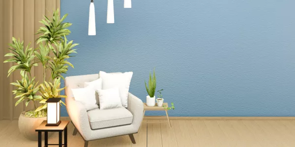
This versatile hue strikes a beautiful balance between the tranquility of lighter blues and the depth of darker shades, making it incredibly adaptable to a variety of design aesthetics and spaces. Its inherent calmness is reminiscent of the clear sky on a bright day or the gentle undulations of a serene sea, providing a soothing backdrop that promotes relaxation and mental clarity.
What sets Medium Blue apart is its ability to blend seamlessly into various decor styles, from the minimalist and contemporary to the more traditional and rustic.
2. Gray-Purple
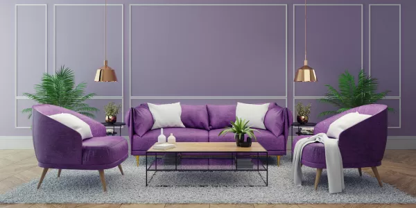
This elegant blend combines the calming neutrality of gray with the depth and mystique of purple, resulting in a versatile shade that exudes modernity and timeless appeal. Its subtle complexity lends itself well to contemporary interiors, adding a layer of richness without overwhelming the senses.
Gray-Purple's unique ability to adapt to various decor styles while maintaining a sense of luxury and tranquility makes it a compelling choice for those looking to infuse their spaces with a serene yet sophisticated atmosphere.
3. Cloudy Green
Picture the soft, gentle hue of a forest wrapped in a morning mist – that's Cloudy Green for you! It's like a breath of fresh air for any room, bringing in a touch of nature's calm without being too bold. This color has a cozy, down-to-earth vibe that makes spaces feel welcoming and relaxed.
Perfect for anyone wanting to add a little natural charm to their home without going overboard. Cloudy Green is all about creating a peaceful nook that feels like a little getaway, right in your own space.
4. Red Clay
Imagine the warm, inviting hue of terracotta pots basking in the afternoon sun – that's the essence of Red Clay. It brings a hearty, comforting vibe to any room, reminiscent of sun-drenched landscapes and rustic charm.
This color is perfect for adding a splash of warmth and personality to your space, making it feel like a snug, welcoming retreat. Whether you're looking to spice up a corner with a dash of earthiness or create a cozy nook, Red Clay wraps your space in a hug that's hard to resist.
5.Ebony
Inspired by the deep, rich darkness of a moonless night sky – that's the beauty of Ebony. It's got a luxurious and sophisticated feel that can make any space look stunningly chic.
This color is fantastic for adding a touch of drama and depth, perfect for creating striking contrasts or a cozy, intimate atmosphere. Whether you're dressing up a feature wall or adding elegant accents, Ebony brings a dash of mystery and class to your home, making it feel like a stylish hideaway.
6. Pearl
This color is all about the softness and lustrous glow, just like a pearl necklace – that's where lies the gentle charm of Pearl. It's a versatile shade that adds a touch of understated elegance to any space, creating a light, airy feel.
Perfect for anyone looking to infuse their home with a whisper of sophistication and a cozy, calming vibe. Pearl is like a gentle hug for your room, offering a serene backdrop that's both comforting and stylish. Whether you're after a fresh, clean look or a soft, romantic ambiance, Pearl is your go-to for making your space feel like a peaceful retreat.
What Paint Colors are Out of Style?
Paint colors that are falling out of style tend to be those that are overly bold, bright, or saturated without a sense of balance. Specifically, neon colors, which were once popular for their vibrancy, are now considered too intense for most interior spaces. Similarly, very dark shades, which can make a room feel smaller and more confined, are being replaced by lighter, more airy hues.
Heavy, saturated tones like deep reds and dark browns are also seeing a decline in popularity, as they can overpower a space rather than enhance it. Instead, there's a shift towards more muted, neutral, and versatile colors that can adapt to various design aesthetics and create a more open, inviting atmosphere.
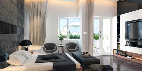
What Colors Make A Room Look Bigger?
Crisp whites and light, reflective hues like soft whites, light grays, and pale blues are key to creating a sense of spaciousness in any room. These colors not only make a space feel bigger and more open by reflecting natural light and giving the illusion that walls are further back, but they also contribute to a more inviting atmosphere.
On the other hand, warm colors can imbue a room with a cozy sense of intimacy, ideal for larger spaces that can handle more color. While lighter tones are adept at opening up smaller areas, darker colors can bring the perception of surfaces being closer, suitable for creating a more defined and cozy space in larger rooms.
This balance between light and dark, open and intimate, allows for versatile design choices that can enhance the perceived size and comfort of a room.
What Colors Make A Room Cozier?
To cultivate a cozier ambiance, embracing warmer tones such as deep reds, rich browns, muted oranges, hunter green, or rust can transform large, open areas into more intimate and welcoming spaces.
These colors excel in making expansive rooms feel snugger and more inviting, especially when you're looking to enhance areas like foyers, studies, or libraries where a sense of warmth is desired over spaciousness.
Adding layers of different shades and textures can further contribute to the room's depth and warmth, creating a rich tapestry of colors that envelop the space in comfort. In smaller spaces where the goal isn't necessarily to amplify size, these warm, inviting hues can turn the area into a cozy retreat, perfect for quiet contemplation or leisurely reading.
Paint Color Selection Mistakes To Avoid
When selecting paint colors, common mistakes can lead to disappointing results. Here are a few to watch out for:
Ignoring natural light
Always consider the amount of natural light in your room, as it can significantly affect how a color looks.
Overlooking undertones
Every paint color has an undertone that can clash with your existing decor if not carefully considered.
Forgetting about the finish
The finish of the paint can affect the color's appearance and the room's overall feel. Matte finishes can soften a color, while glossy finishes can intensify it.
People also ask
How do I choose the right paint color for my room?
Consider the room's function, the mood you want to create, and the existing furnishings and decor. Test samples on your walls to see how they look in different lighting conditions.
Can I use dark colors in a small room?
Yes, but use them wisely. Dark colors can add depth and sophistication to a small space when used as an accent or on a single wall.
How often should I repaint my interior walls?
It depends on the room's usage and the quality of the paint. High-traffic areas may need a refresh every 3-5 years, while less used rooms can last longer.


